One leaf. Every color.
A complete redesign of Purium's product line: biodegradable packaging with a gradient color system, plus a 12-week Welcome Guide that carries the brand into the customer experience.
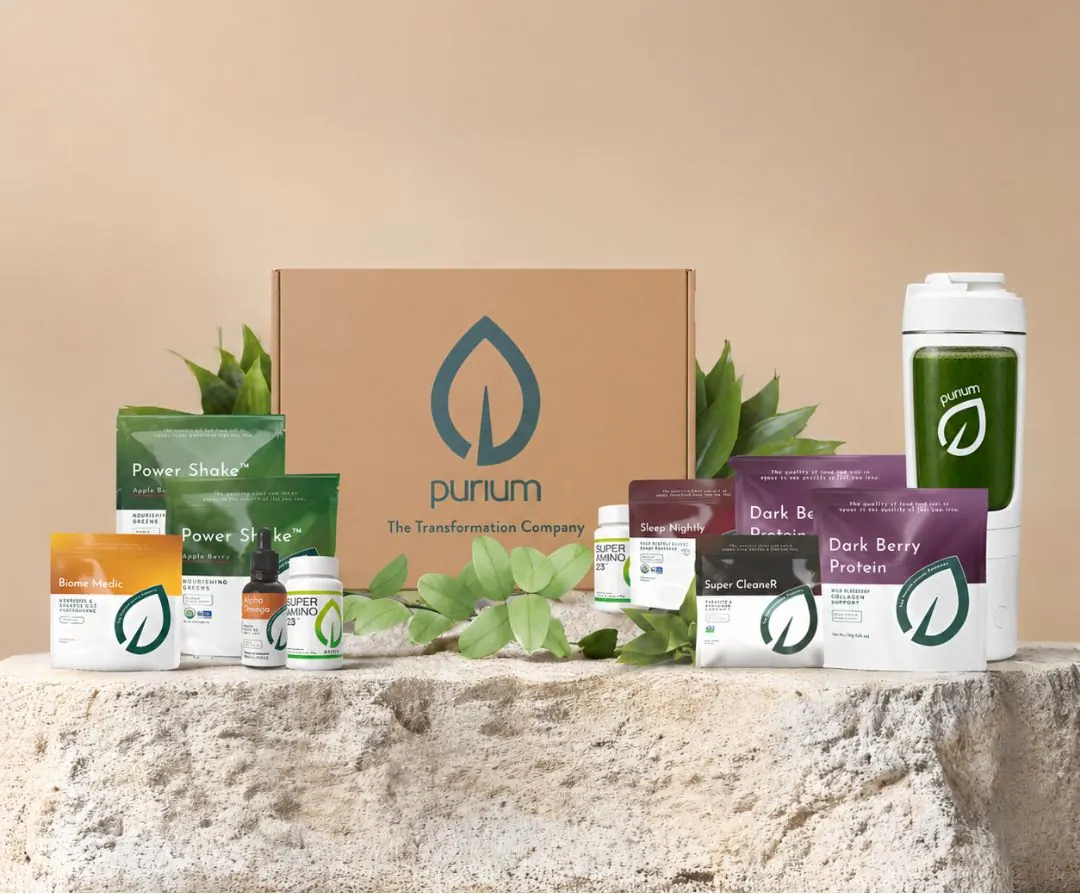
A complete redesign of Purium's product line: biodegradable packaging with a gradient color system, plus a 12-week Welcome Guide that carries the brand into the customer experience.
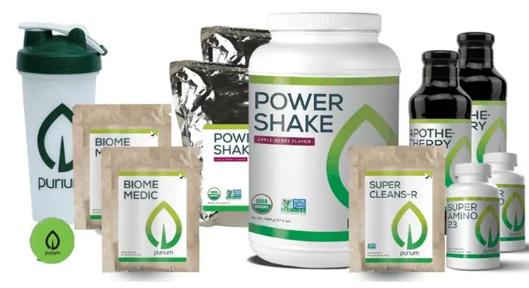
Tubs, foil pouches, kraft sachets and glass bottles each looked like a different brand. The line needed to feel unified, modern, and sustainable.
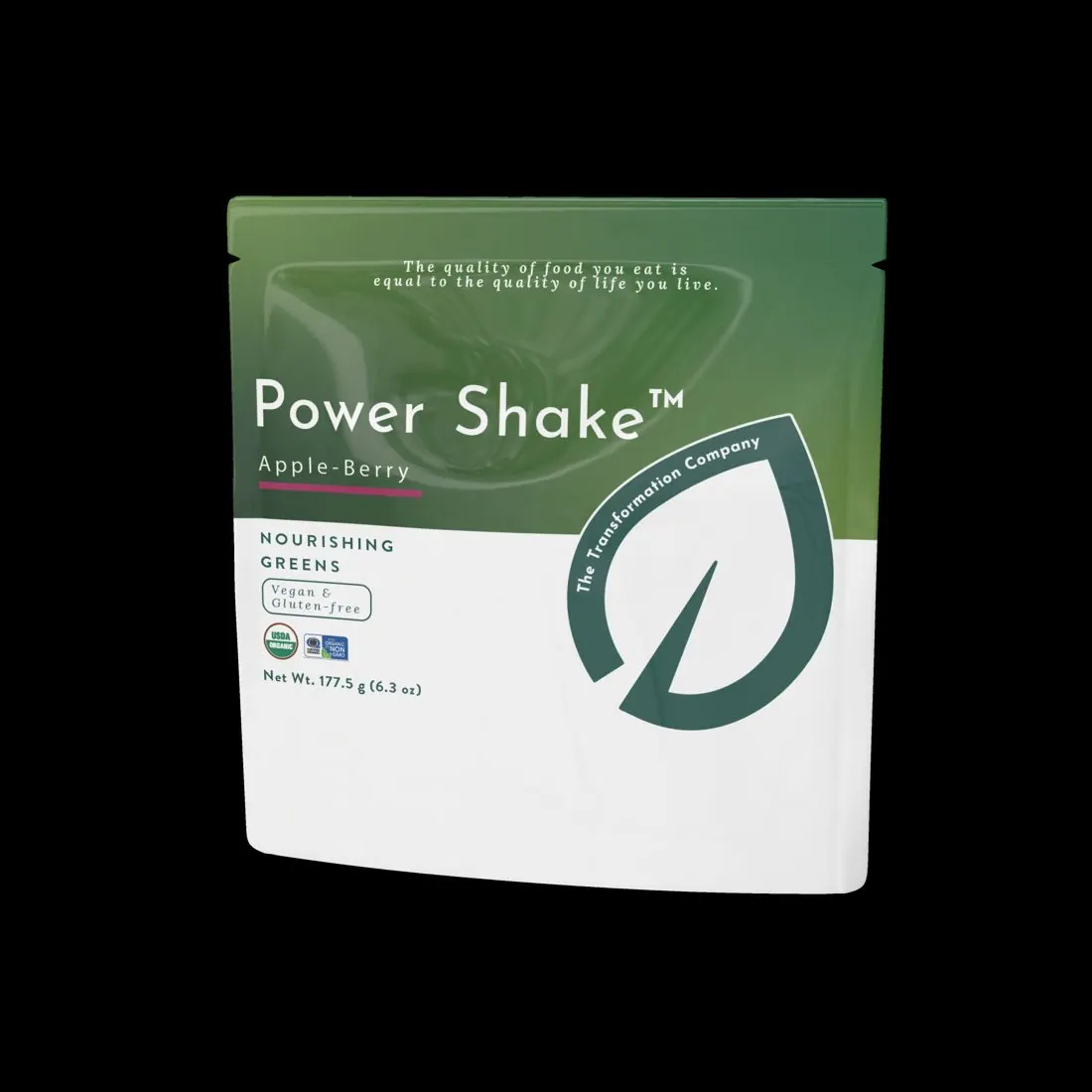
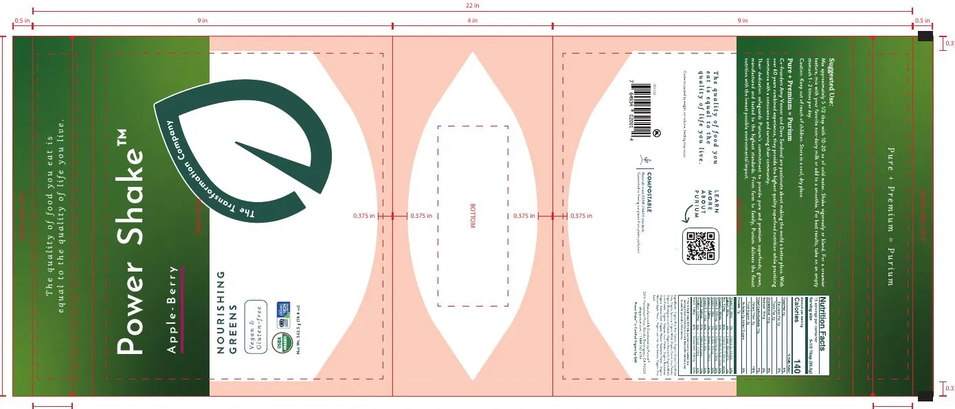
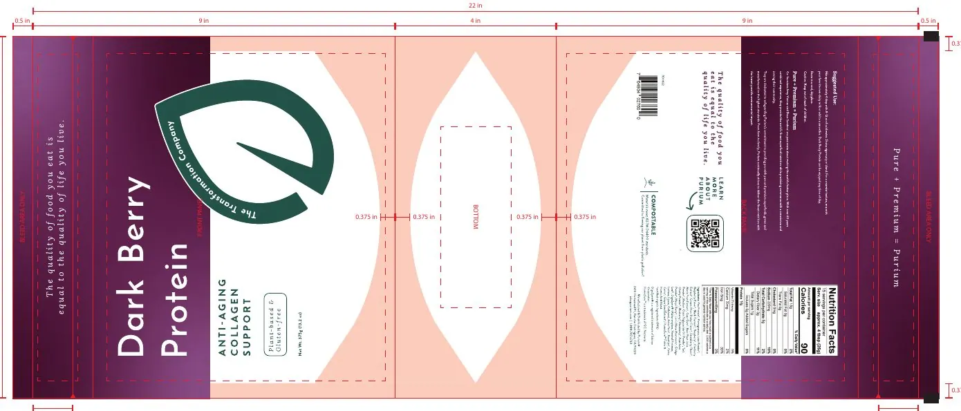
A bold gradient above, a clean white base below, a friendly sans-serif for the name, and an elegant serif for the brand line. Organic and Non-GMO marks sit in the layout, not on top of it.
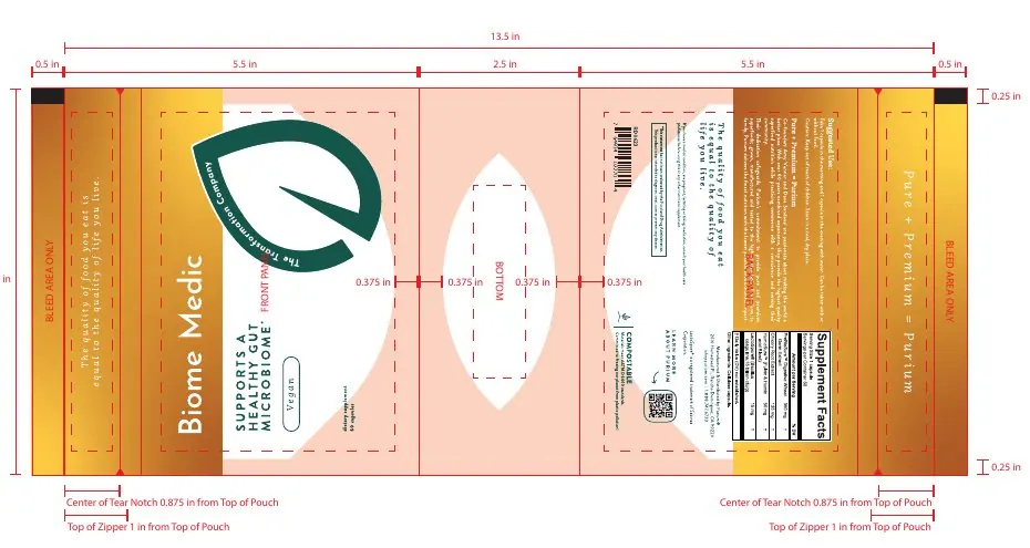
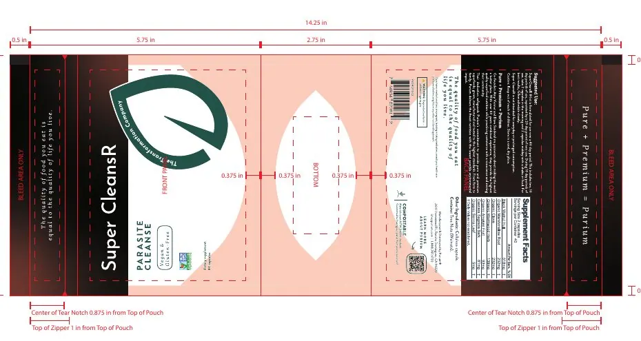
Each color is drawn from the product's purpose or ingredients, so customers find what they need before reading a word.
nourishing greens
collagen support
gut microbiome
algae-sourced DHA + EPA
deep restorative sleep
parasite cleanse
Every pouch is engineered as a production dieline: front, back and bottom panels, seal zones, tear notches, zippers, and a compostable mark, all designed to fit the line's system.
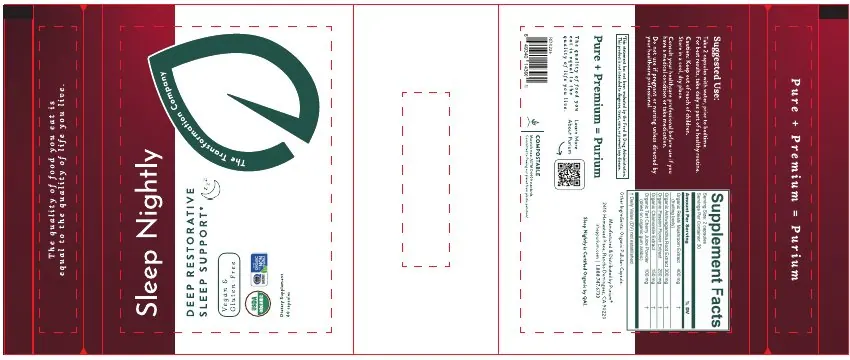
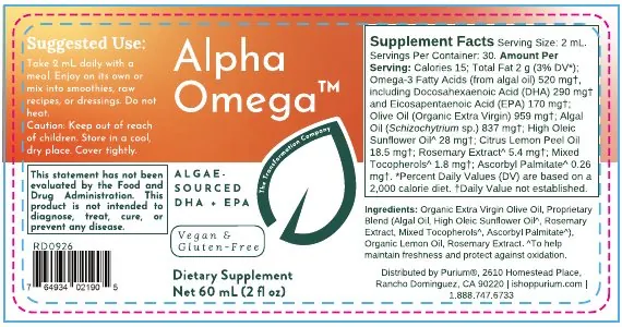
A bottled juice reimagined as a capsule that fits the new pouch system, in a deep burgundy that signals rest.
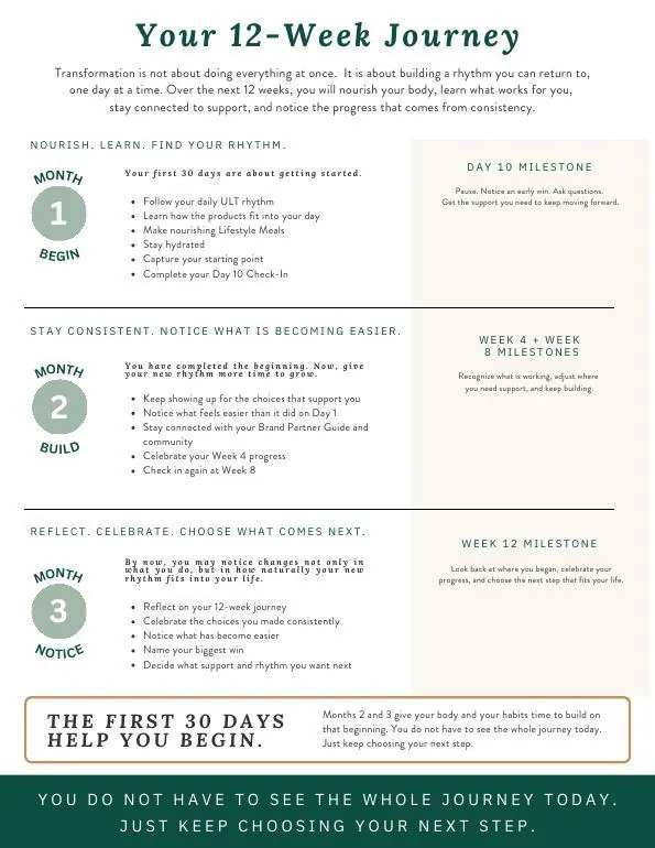
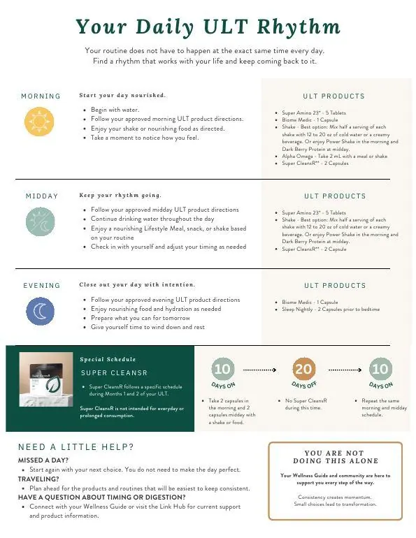
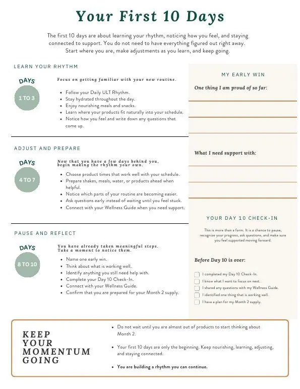
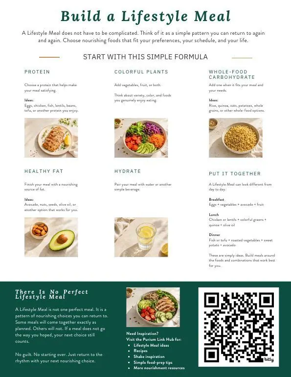
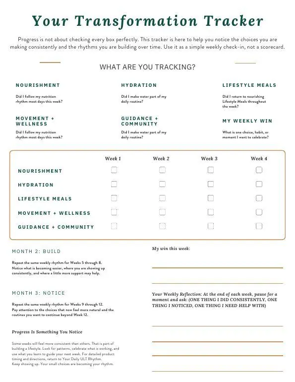
A 12-page companion that guides customers through three months: Begin, Build, Notice.